Nuggit
app
UI Kit
Role: UI Designer
Client: nuggit GmbH
(2021)
nuggit.de is a yearbook service, helping students
to create and design their graduation books online.
As part of the nuggit yearbook app redesign project, I was tasked with creating a design system for the app. The dashboard serves as a starting page for both new users and those who have been working on their book for a while.
Problem: quickly growing number of components, no system to guide the creation of the new components, no proper overview of components, duplicates.
Outcome: cleaned up and systematised UI Kit that features over 100 components of various complexity levels, colour library and spacing guides. Components use variants and are grouped together logically which makes development process easier.
Outcome: cleaned up and systematised UI Kit that features over 100 components of various complexity levels, colour library and spacing guides. Components use variants and are grouped together logically which makes development process easier.
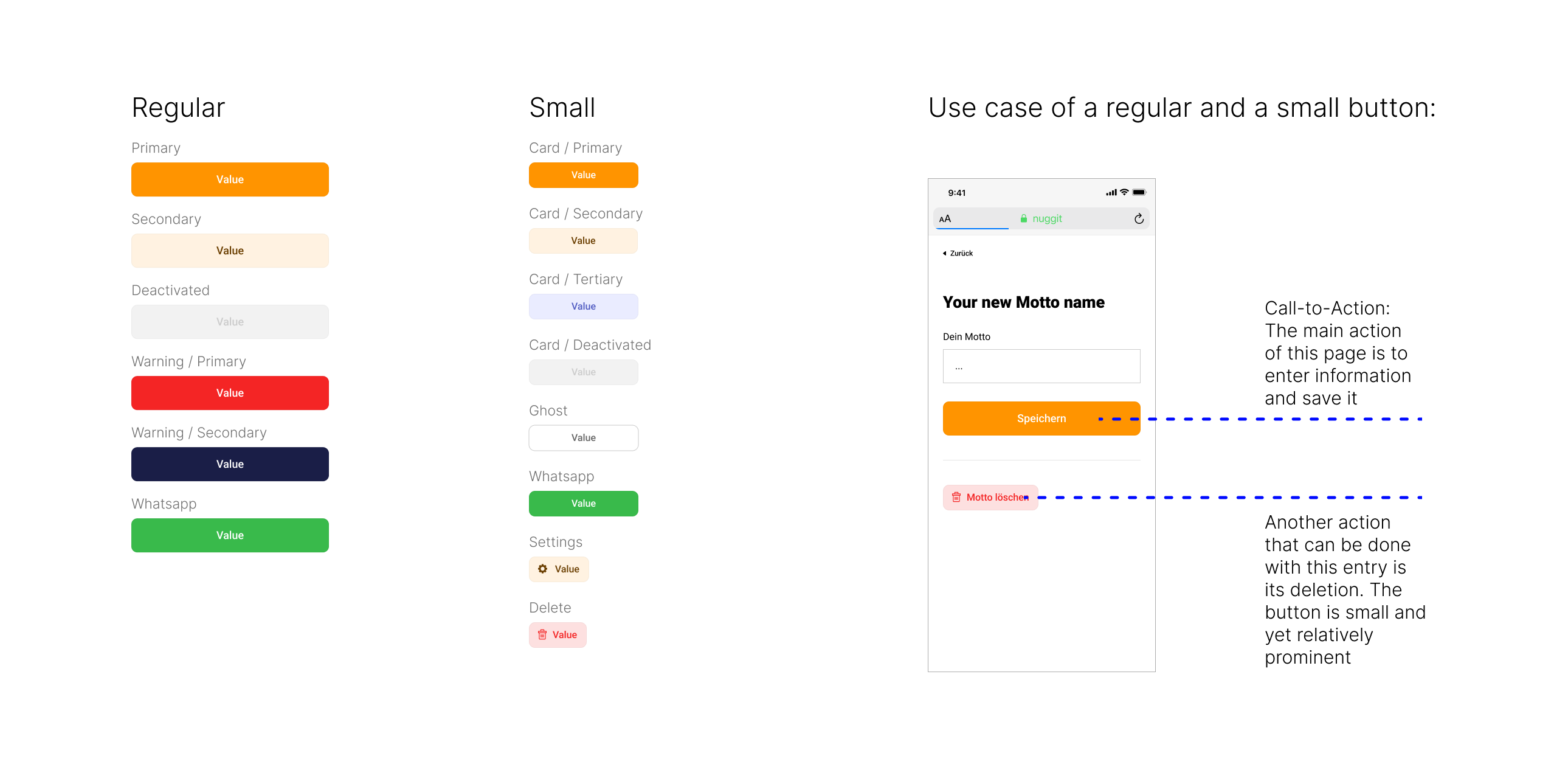
Buttons
Default- and small-sized buttons were created in order to establish visual hierarchy on the screens and distinguish between primary and secondary interactions.
Colour palette
Vibrant | Youthful | Modern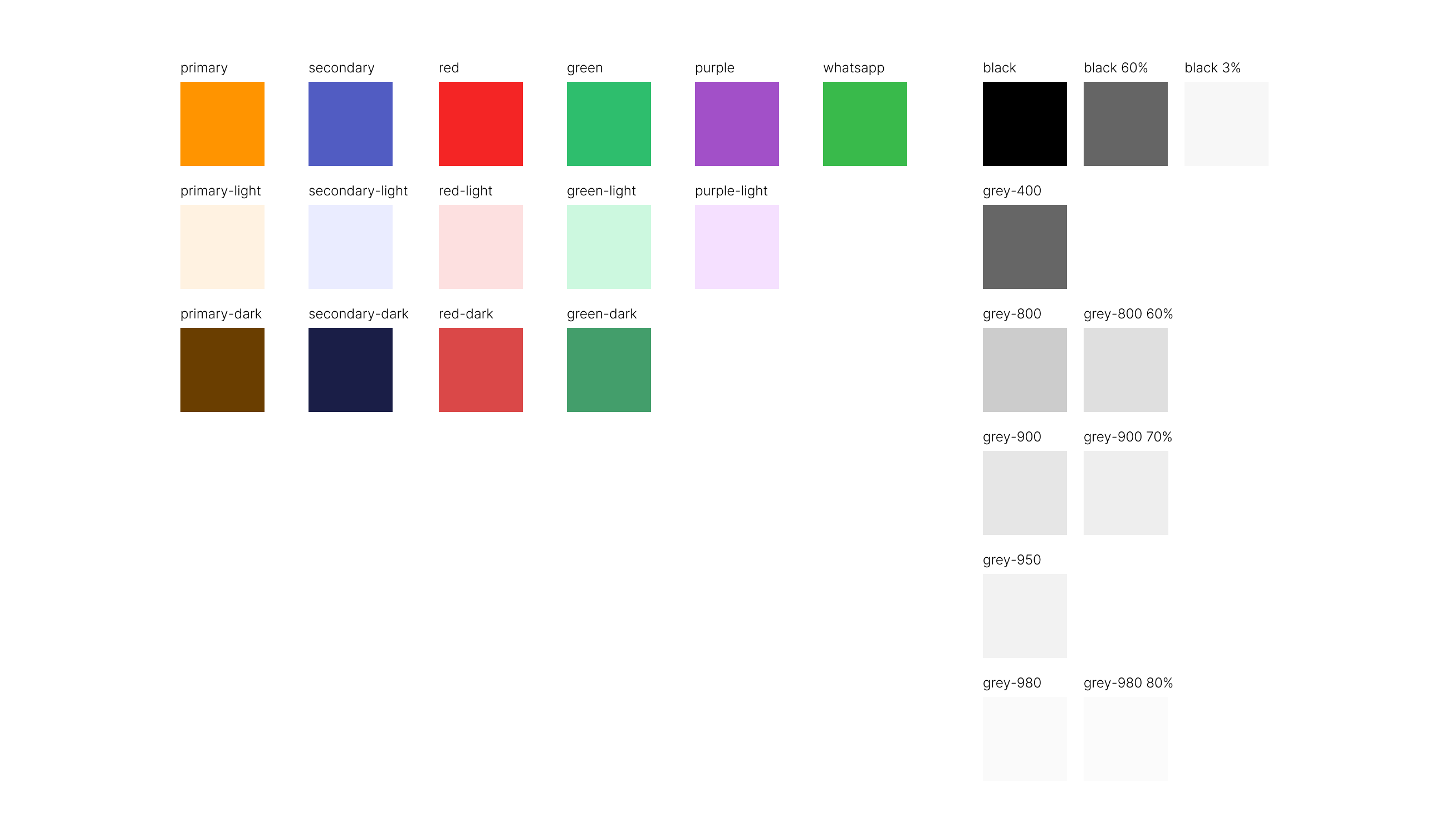
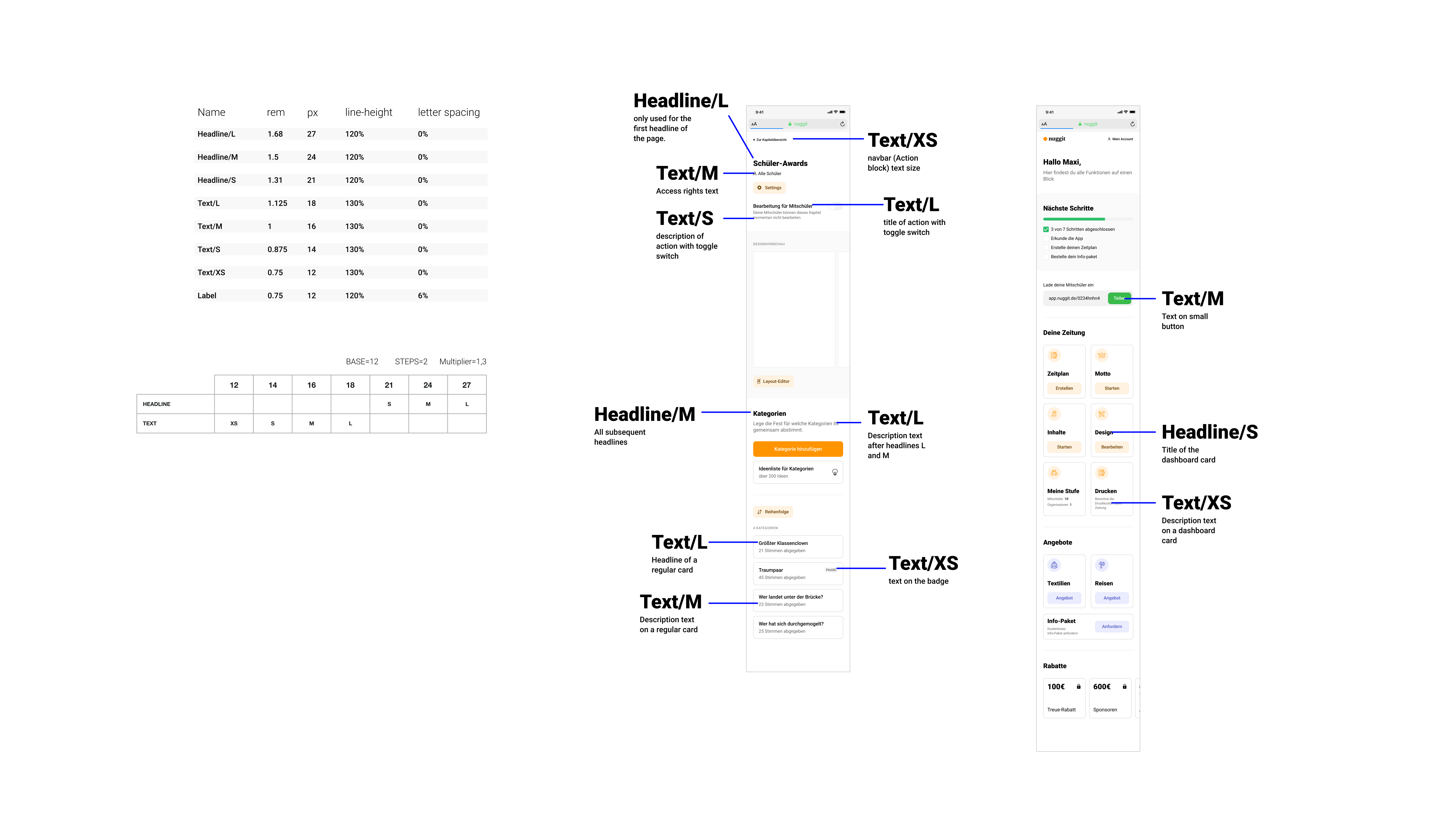
Text styles
At some point general patterns in text use emerged and thus many styles already in use had to be systematised. Developers required rem values, so I established 12px as a base with a multiplier of 1,3 and step of 2. Below is a bit of documentation that explains the system.